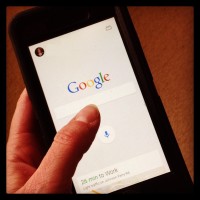
Have you noticed a shift in traffic to your website since Tuesday, April 21? If it’s dropped, check to see if your site is mobile friendly. Google announced in February it would be adjusting its algorithm on April 21 to favor sites that are mobile friendly in its mobile search results. These changes, which many in the SEO world have nicknamed these changes “Mobilegeddon,” mean that people who use Google to search on their smartphone may not be finding your site at the top of their results – if your site isn’t mobile friendly. If you haven’t updated your site, it may be ranked way lower, which in turn could mean a loss of business.
Is your site mobile friendly? Check here to see if Google thinks it is.
This change makes sense, since more people are searching on their phones, tablets and phablets and Google should reward websites that offer good user experiences to everyone, regardless of their device.
What does this have to do with email? Everything!
iPhones and iPads account for 40% of email opens, according to Litmus. Since your emails are most likely being viewed on a mobile device, it is incredibly important that your messages be designed with the mobile viewer in mind. Here’s a primer from MailChimp on designing your emails for mobile viewers.
Keep the mobile experience going on your web site.
Since your emails should have calls to action that lead the recipient to your website, you’ll want to make the experience of viewing your landing pages on their phone an easy one. Email marketers have long been preaching the need for mobile-ready emails, now Google is rewarding those who do the same with their web sites.
Here’s another resource about this change:
Search Engine Land: Are you ready for Mobilegeddon?
Mobilegeddon is here http://t.co/jVjVzrPUMv
Mobilegeddon is here – my latest blog post http://t.co/7yGW1I881u
A word about mobile-friendly sites & emails. Mobilegeddon is here http://t.co/cOCFNI6Gy0 #books #authors
“@datavalidation: RT “@SandiSolow: Mobilegeddon is here – my latest blog post http://t.co/7yGW1I881u”” -> Thx for the RT!
“@mimischroeder: A word about mobile-friendly sites & emails. Mobilegeddon is here http://t.co/7yGW1I881u #books #authors” Thx for sharing!
Mobilegeddon is here http://t.co/bEsgrJEWEP via @SandiSolow