Today is Gmail’s 10th birthday – yes that’s right, it launched on April 1, 2004. And given the changes that underway with Google’s email platform, I thought this might be a good time to bring what’s new in Gmail to your attention. As marketers, the stats clearly indicate that this is a domain we cannot take lightly!
First up, a prominently placed unsubscribe link
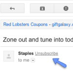
 You may have noticed that Google has placed a link to unsubscribe from the email you’re reading at the top of the message you’re reading. It’s right next to the “from” name and makes it easy for subscribers to opt out instead of forcing them to hunt for the link somewhere in the message. The appearance of this link isn’t consistent – it isn’t there for every promotional email and some days it may be there for a sender and some days it may not be.
MailChimp has written a nice blog post about how this new link works and what it means for your sending reputation. Worried that your unsubscribes may spike? Attrition is natural and should be welcomed. Better to focus your efforts and dollars on those who are engaged with your messages rather than forcing content on someone who’s uninterested.
Gmail’s second recent change is to the Promotions tab.
The shift to the tabbed layout in 2013 was a source of great discussion among email marketers – would marketing messages be ignored now that they were sequestered away from personal messages? Or would this be a change for the better? The consensus has been that relevancy and quality win above all and that if someone is interested in your message, they will seek it out.

Source: Gmail blog
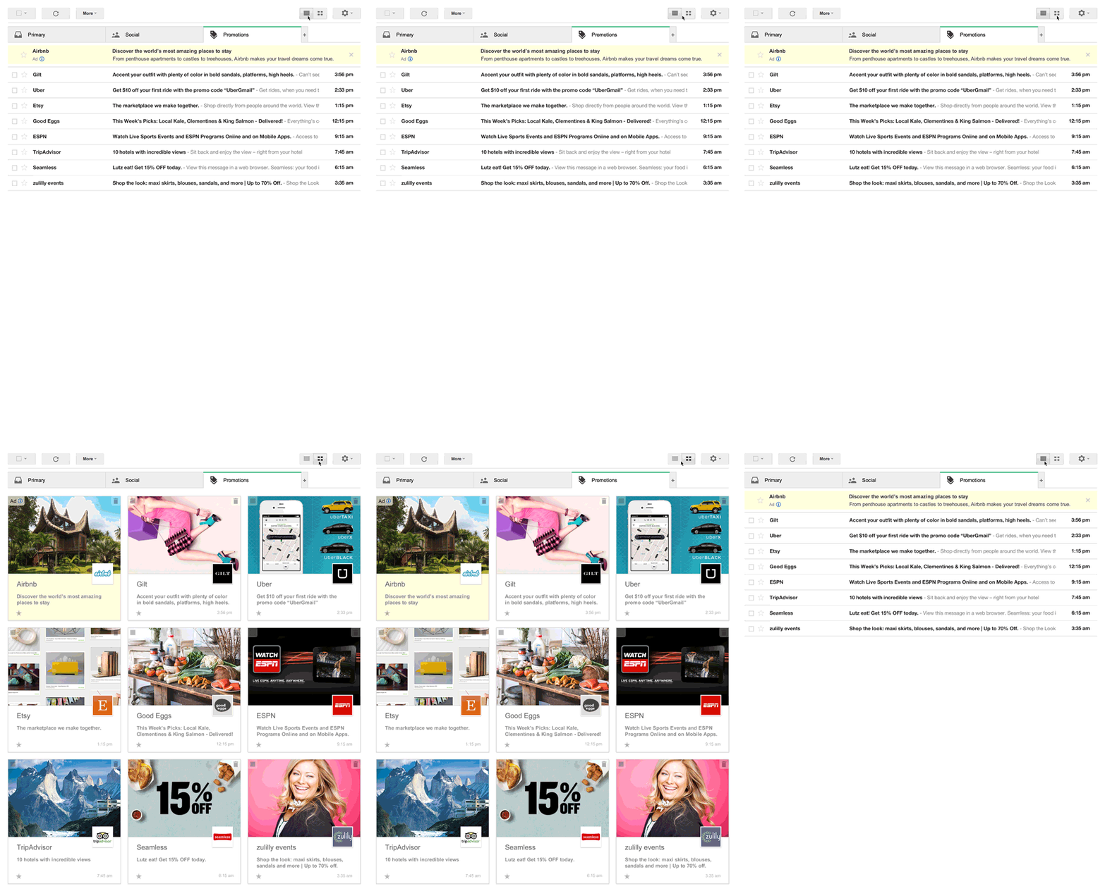
Now Gmail is launching the next iteration of the Promotions tab. This Pinterest-like layout allows for infinite scrolling and makes it easy to scan messages to find ones that look interesting. Promotional messages usually don’t lack for imagery and this new format makes it easy for a featured image to be on prominent display in a subscribers inbox.
Litmus has more information about turning this feature on and how it works in this blog post. If you’d like to test this on your campaigns, here’s a tool from Fresh Inbox and one from Litmus. Brand marketers will want to check Google’s Developer site.
What do these changes mean?
1. It’s important to have a Google+ page for your business if you don’t already. Whether a +1 button, Google’s version of the Facebook “like” option, is next for Gmail inboxes or not, we can already see the integration between G+ and email in how the messages in Promotions tabs are rendering and how information from G+ is being pulled into the message.
2. Ads are now included in this promotion grid layout. These are noted by a small icon now appears in the top-left corner and a different background color shown in the lower portion. Not much different than any other email.

Source: Litmus
3. If you’re not already segmenting your list, this would be a good time to test engagement of your Gmail subscribers vs. other domains. If you’re noticing a higher unsubscribe rate for Gmail readers, do some digging to understand who they are and what’s causing them to unsubscribe. Are they old subscribers who never opened much in the past? Did they comment that your frequency was too high?

Changes with Gmail http://t.co/pKdzNUUm9O