Actually, I have no idea if the gymnast who spawned this meme during the London Olympics gives a hoot about email or not. But I’ve found that site to be quite amusing and just wanted an excuse to tie it into my neglected blog.
Of what poor email practices do I speak? Here are a few pitfalls to avoid:
Lack of testing: Sadly, I speak from experience. I’ve had this one bite me. Test the rendering of your message across platforms to be sure your recipients will actually be able to see your message. (But take come comfort in knowing it won’t look completely perfect 100% of the time.) Test delivery times and subject lines. By doing these things, you’ll begin to learn what best resonates with your audience.
Thinking content doesn’t matter: This couldn’t be further from the truth. Marketers should spend the bulk of their time asking if their message is easy to digest and act upon. Keep in mind an audience’s interests and expectations when developing an email. Don’t overload a message with text when a few short sentences and an image can quickly convey your point.
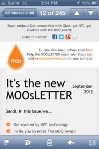
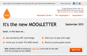
Ignoring the mobile audience: It is possible to send a campaign that will render differently when viewed on a smartphone than when opened on a desktop or laptop computer. But do so intentionally? That’s smart business. Many emails have been designed to appear one way on a mobile device and differently on non-mobile platforms. Let’s take a recent email I received from Moo.com, a site for custom printed business cards and other printed paper goods.
Here’s the top of the email when I viewed it on my iPhone and the same message when viewed in my desktop web browser:
 |
 |
You’ll notice the image on the left has a streamlined header and put the message’s contents in a vertical line for quick scrolling. Viewers on a smartphone use their finger as their mouse, which means that action buttons shouldn’t be too small. Nor should the font size – who wants to squint to read a message? It’s more likely someone will just delete the message than enlarging it.
And that concludes this list of email pitfalls. This surely isn’t an exhaustive list. But stay tuned – there’s more tips and advice to come.


Comments are closed.